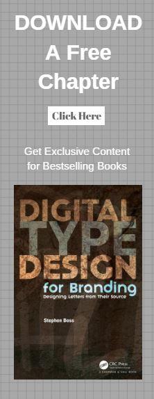
CRC Press is pleased to share with you our author Q&A session with Stephen Boss, author of Digital Type Design for Branding: Designing Letters from Their Source
Q&A with Stephen Boss
Congratulations on the recent publication of your book, Digital Type Design for Branding! What do you want your audience to take away from the book?
Thank you. I would love the audience to look at our alphabet as something more than a collection of curves, lines and circles. I would like them to understand that each character has its unique tale (refer to the sample chapter on the Q) and many are based upon things which our ancient relatives interacted with.
I would like them to use this knowledge in perhaps the naming of a business, the creation of a logo or the wording of a headline. Basically, I would like them to understand the history of each glyph in our alphabet and use that knowledge to enhance their projects.
What audience did you have in mind while writing you book?
I started off with the intention of focusing on young designers, but the more the book developed I could envision it appealing to those interested in calligraphy, writing and history. With the advent of platforms like Wordpress, many people are finding interest in fonts, and how a font can alter (or in some cases distract) the perception of their message.
What did you enjoy about writing the book?
I truly loved reviewing all of the items our ancestors etched and inscribed their new letterforms on, then seeing the letterforms spread through the ancient world. Writing was a much more involved quest for the ancients. Having to etch on a clay tablet, carve on a wooden bowl, or draw on a cave wall was truly an endeavor compared with using an ink and quill, or a modern keyboard. These ancient pieces of history brought me much pleasure while writing the book.
About the Author
Who has influenced you the most?
My inspiration is drawn from the early Twentieth Century, such schools and movements as De Stijl, The Bauhaus and Russian Constructivism. I am also very fond of Poésie Graphique which is the art of creating visual poetry. All of the aforementioned movements reduced typography and design to their bare essence, while using it illustratively. That being said, one of my favorite graphic artists is Max Kisman. His aesthetic, in my view, draws on all of the movements I listed, and boils all elements down to their roots; geometry, simple color and an eye for positive and negative space.
What first attracted you to design as an area of study?
My Great Grandfather was in the applied arts, so I guess you could say it was in my blood. As a child I had a fondness for calligraphy and drawing in general, but used old fashioned tools, like nibs and ink. As a young adult, studying the applied arts became a natural, maintaining my affection for letterforms by focusing on their creation. As time moved on, so did the tools of the trade. I traded in T-Squares, French curves and triangles for a mouse and Adobe software.
Tell us an unusual fact about yourself and your teaching or writing style?
While writing, I often pay attention to how words look, what letters are placed next to each other. Do they complement each other? Do they create tension? To me, word selection also sets up a visual rhythm that leads the reader through the text.
Do you have plans for future books? And what’s next in the pipeline for you?
I do have a new book in the pipeline, which is about the relationship of handwriting and psychological conditions. The book could be used as a tool for art therapists to compare their patients handwriting against the writing of those with documented conditions.
I am also working on a new geometric typeface inspired by De Stijl. I haven’t named it yet, but keep an eye on my social media accounts for progress. I would greatly appreciate hearing from purchasers of my book, and would happily post some tips and tricks relevant to their projects.


